TIBCO X
Visual design and motion graphics across three deliverables for the TIBCO X rebrand — an all-hands infographic, an internal slide system, and a bumper video — under the direction of TIBCO's senior UX/UI lead.

MY ROLE
Visual design · 3D exploration · Motion graphics · Slide design · Brand asset design · Cross-functional collaboration
Outcome
Delivered three distinct but recognizably on-brand pieces — a keynote-caliber infographic, a fast-reading internal deck, and broadcast-ready motion — each tailored to its audience rather than forced into a single reused template.
The Challenge
TIBCO X represented the company as three layers, symbolized by an X where each corner stood for a different layer's function. Leadership wanted all four corners visible at all times, across every use case — but the brief was ambiguous about why, and some design components had already been built by another brand designer I had to design around.
Three deliverables, one visual system
TIBCO X represented the company as three layers, symbolized by an X where each corner stood for a different layer's function. Leadership wanted all four corners visible at all times, across every use case — but the brief was ambiguous about why, and some design components had already been built by another brand designer I had to design around.
01 — All-hands infographic
Validating the brief in 3D before designing in 2D
Built a 3D model to show leadership how different orientations affected the four-point X. The exploration demonstrated that a stacked 3/4 view would always obscure one corner from the below layers, helping the team move from the original requirement to a more practical solution using one partially hidden point and a callout line.


_JPG.jpg)
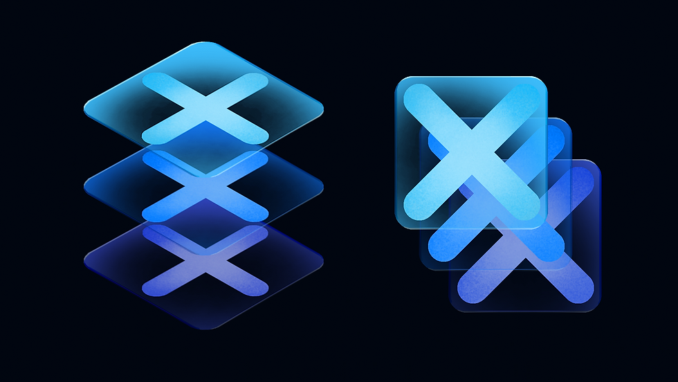

That exploration led to a tile-based system instead: three tiles, one per layer, each in its own cool-toned color from the TIBCO palette (blue, purple, aqua), with a glass texture and beveled depth for a modern, dimensional feel. The X itself was etched into the glass, with the layer underneath left transparent — so every corner stayed visible without forcing a single rigid viewing angle. It was built for one high-impact moment: the all-hands keynote.
02 — Internal business-unit deck
Two contrasting themes built around atmosphere and depth
Because the deck needed both light and dark versions, I treated them as two ends of the same visual idea. The light theme draws from the upper layers of the cloud — airy, soft, and textured, with Japanese-inspired compositions and lighter typography. The dark theme explores the opposite extreme, using cooler ocean-like depth, layered forms, and brighter accents to create a more immersive, high-contrast feel. Together, the two directions feel distinct while still supporting the broader themes of layering, atmosphere, and modernization.

.png)

.png)
03 — Bumper video
Motion built from the existing brand identity
The bumper needed to feel unmistakably TIBCO on broadcast and social — so rather than introduce a new visual language, I worked from the existing TIBCO logo and marketing "whoosh" assets, redesigning them in Illustrator and animating them in After Effects. I built matching light and dark intros/outros and worked with a videographer to layer in sound and finish the edit.


